Email template builder
Design reusable branded emails with the drag-and-drop block builder.
The email template builder creates reusable designs for email blasts and flow emails. Build the layout once (logo, colors, footer) and campaigns start from a polished base instead of a blank canvas.
Create one from Templates → New template → Email.
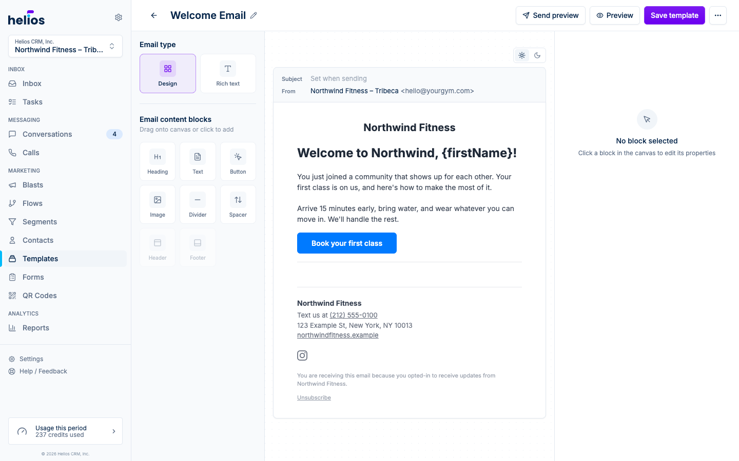
Email type
The left panel starts with an Email type choice:
- Design: the drag-and-drop block builder. Best for newsletters, promos, anything with layout.
- Rich text: a simple formatted note that renders like a personal email. An Include footer toggle appends your business name and contact details above the unsubscribe link.
Blocks
In Design mode, the Email content blocks palette offers:
| Block | What it’s for |
|---|---|
| Heading | Section titles. |
| Text | Paragraph copy, with merge fields. |
| Button | The call to action: link and colors are configurable. |
| Image | Photos and graphics. |
| Divider | A horizontal rule between sections. |
| Spacer | Vertical breathing room. |
| Header | Your logo and inbox name at the top. One per email. |
| Footer | Business details, social links, and the unsubscribe link. One per email. |
Drag a block onto the canvas (or click to add), then reorder by dragging. Select any block to edit its properties in the right-hand inspector: the Header exposes logo, height, and alignment; the Footer takes your phone, address, website, and social URLs.
Header and Footer blocks pre-fill from your workspace settings (name, logo, phone, address, socials), so branding is automatic.
Dark mode colors
Every email you send automatically gets a readable dark-mode version. Recipients whose email app uses dark mode (Apple Mail, iOS Mail) see adapted colors instead of your light design on a dark surface:
- Blocks using default colors switch to the standard dark palette.
- Custom colors that would be hard to read on a dark background are adjusted automatically: the hue stays yours, the brightness shifts until the text is legible.
- Sections with their own background color keep it in dark mode, along with the colors inside them, so designed banners and cards stay exactly as you built them.
To art-direct the dark version yourself, switch the canvas toggle to Dark mode. Color fields in the inspector then edit the dark variant: Auto shows the color Helios derived, and picking a color replaces it for dark mode only (the reset button returns it to Auto). Your light-mode colors are never affected.
The inspector also warns when a color combination is hard to read (below the 4.5 contrast recommendation), in either mode.
Previewing
- The canvas has a Light mode / Dark mode toggle that simulates how email clients render each scheme, and switches the inspector between light and dark color editing.
- Preview opens a full render in a modal.
- Send preview emails the template to an address you choose, with merge fields filled with sample values. Always send one before relying on a template: real email clients are the only truth.
Using the template
Saved templates appear:
- In the email blast composer’s Templates tab: click Use to apply it as the campaign’s starting point, then edit freely (Revert to a blank email undoes it).
- In the flow Send email action’s composer, the same way.
- On the Templates page for editing, duplicating, and previewing.
Applying a template copies the design into the campaign: later edits to the template don’t change past campaigns.