Landing pages
Publish a hosted page that sells your memberships, packs, and schedule from one link.
Pages are hosted landing pages for selling what your gym offers. Put your memberships, class packs, and upcoming schedule on one page, share the link in a bio, text, or QR code, and every card links straight to checkout or booking. No website changes needed.
The Pages page lists your landing pages and your forms together, with the type, status, and views of each. Filter by type or status, sort by newest or most viewed, and click Create a page to build either a Landing page or a Form.
The page builder
The builder keeps everything in one place:
- Build: the blocks that make up the page.
- Design: color mode, brand color, imagery, and type, shared with the form design system.
- Publish & share: publish a private draft, then copy its live link or download its QR code.
A new page walks the same path as numbered steps: 1 Build, 2 Design, 3 Publish & share.
Click the page title in the builder header to rename the page. The title labels the page in your list and in browser tabs; it does not render on the page itself. If you save without one, Helios names the page from its content, so a missing title never blocks a save.
Build the page
New pages start with a conversion goal instead of an empty canvas. Choose Welcome new visitors, Sell a membership, Sell a class pack, Book a class, Promote an event, or Show this week’s classes to add focused starter copy and the matching commerce block (your intro offer, a membership, a pack, upcoming class times, an event, or a live weekly schedule). Choose Start from scratch under the grid when you want to build from the block palette.
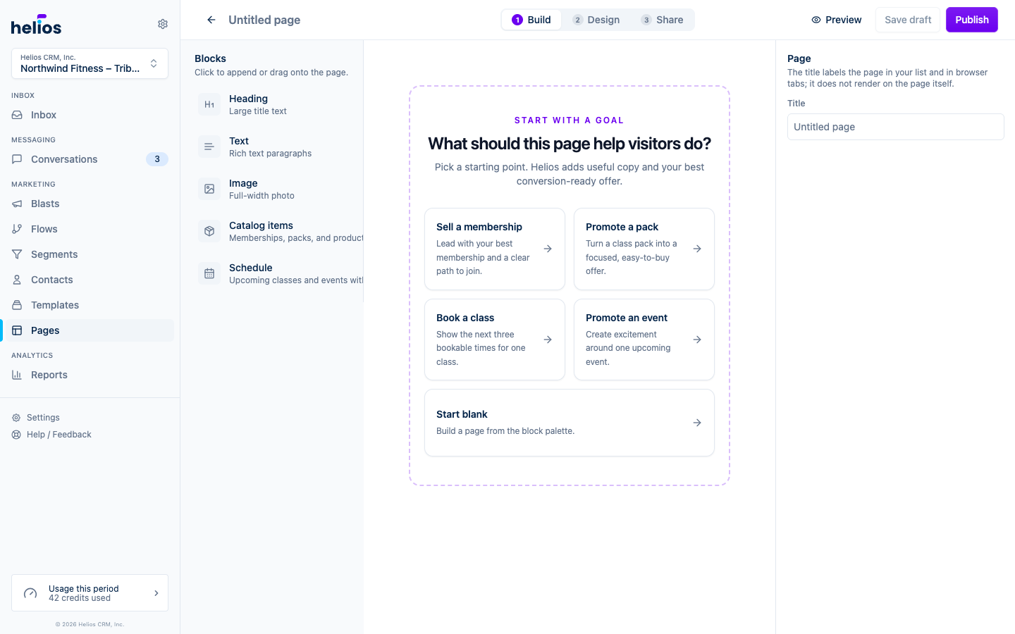
When synced data is available, Helios recommends records that are active, visually complete, and ready to convert through a working checkout or booking link. Search still shows records that need attention, with labels such as Missing checkout link, but you cannot add a record that would leave visitors without a next step.
Open Build to work directly on the page. Select a block in the left palette to append it, or drag it to a specific position. Select any block on the canvas to edit it in the right panel. The selected block shows controls to drag, move up or down, duplicate, or delete it.
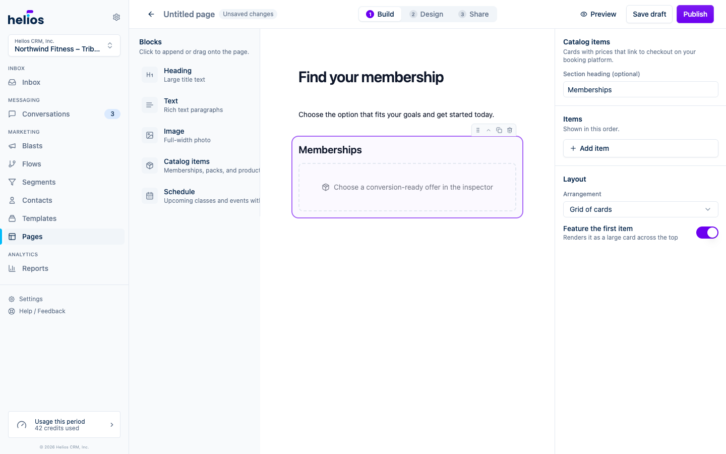
You can also reorder the selected block with the keyboard. Hold Option on macOS or Alt on Windows and press the up or down arrow. Press Delete or Backspace to remove it when you are not typing in a field. On a narrow screen, selecting a block opens its editor in a sheet.
| Block | Use |
|---|---|
| Heading | Large title text in two sizes. Lead the page with your offer. |
| Text | Paragraphs, lists, and links. Pitch the offer in your own words. |
| Image | A full-width photo. Pick an aspect ratio and focus point so any photo size looks right. |
| Catalog | Memberships, packs, and products from your booking software, each with a checkout link. |
| Events | Hand-picked sessions, one class’s upcoming times, or a promoted event. |
| Schedule | A browsable weekly schedule of every class, with live availability and booking links. |
| Header | Your logo or gym name, pinned to the top of the page. |
| Footer | Contact info and links, pinned to the bottom of the page. |
Catalog items
The catalog block pulls memberships, class packs, and products straight from your connected booking software, so names and prices stay accurate. Search and pick the items to feature, then add an optional section heading.
One item is shown as a full offer: type, name, description, price, and checkout button. Two or more stack as rows so prices and buttons line up. Photos appear when the item has one; there is no empty placeholder when it does not. Every offer can carry its own photo. Click the thumbnail on a picked item to upload a custom card image; it replaces the one synced from your booking software on this page only, and removing it brings the synced image back. The same control appears on a promoted event.
Events
The events block can show three kinds of thing; pick one in its settings:
- A class’s upcoming schedule: pick a class and the block shows its next available times automatically, so the page stays current without becoming an overwhelming schedule. This is what the Book a class goal adds.
- Events: hand-pick upcoming events. A single picked event renders as a focused promotion with its image, description, date, location, availability, and booking button; this is what the Promote an event goal adds.
- Class sessions: hand-pick specific sessions when you want full control over the list.
Unavailable and sold-out sessions are labeled clearly.
Schedule
The schedule block puts your full weekly schedule on the page, the way visitors expect to browse it:
- Day tabs across the top with arrows to page through future weeks.
- Each session shows its time, instructor, location, and a limited-spots warning when remaining capacity is low. Click a class name to expand its description.
- Every session gets the right action automatically: Reserve links to booking, full classes offer Join waitlist when your booking software has one with room, and sessions show Full or Ended when there is nothing left to do.
There is nothing to pick or maintain: classes sync from your connected booking software every hour, so times and availability stay current on their own. Add an optional section heading and the block does the rest. If a session has no booking link from the provider, it still appears on the schedule as information.
Header and footer
Optional Header and Footer blocks frame the page. The header pins your logo (or gym name) to the top; pick the image, its height, and alignment. The footer pins your contact info to the bottom: gym name, a tappable phone number, address, and links to your website and social profiles. Both start pre-filled from your Brand kit and inbox settings, and each can be added once per page.
An incomplete block (an empty heading, a catalog block with no items picked) stays in the builder while you work but never renders on the live page.
Text us button
When a page has a Footer, it also shows a Send us a text button (under a “Questions?” prompt) so a visitor who is not ready to buy can start a conversation instead of leaving. Tapping it opens their messaging app with a text to your Helios number, and the reply lands in your inbox like any other conversation. The button is on by default whenever a Footer is on the page; to turn it off, select the Footer block and switch off Show button under Text us button. Pages without a Footer never show the button. If your inbox has no phone number yet, the button stays hidden until one is set up.
Draft and publish
Pages have a working copy, so you can edit safely while a page is live:
- A new page saves as a Draft. Drafts are private: the share link shows nothing until you publish.
- Click Publish to put the page live at its hosted link.
- Edits to a live page are staged as Unpublished changes. The live page keeps serving the published version until you click Publish changes, so a half-finished edit never leaks.
- Staged edits do not follow you out of the builder: if you leave with unpublished changes, Helios asks before discarding them and the live page stays as it was. Publish to keep them.
The status badge in the builder header and on the Pages list always shows where a page stands: Draft, Live, or Unpublished changes when a live page has staged edits.
Click Preview at any time to see the page full screen exactly as visitors will, including your staged edits, in phone and desktop widths and both color modes.
Design the page
Switch to Design to style the page. It shares the form design system: pick a brand color and Helios builds matching light and dark palettes with readable contrast. If the inbox has a ready Brand kit, a new page opens with that kit’s color mode, brand color, font, and corner radius already filled in.
- Color mode: Match visitor follows each visitor’s light or dark setting, or lock the page to Light or Dark.
- Brand color: buttons, accents, and supporting tones in both palettes come from this color.
- Fine-tune colors: override the background, text, or button colors per palette.
- Typography & shape: font family and corner radius.
The live preview beside the panel updates as you make changes.
Share the page
Open Share for everything you need to get the page in front of people:
- Draft: a private page shows Publish page instead of sharing controls. Publish it to get a live link.
- Live link: after publishing, copy the hosted page link to post, text, or put behind an ad.
- QR code: after publishing, download the live link as a high-resolution PNG for flyers, posters, or the front desk.
- Link preview: control the title, description, and image the link shows when shared in texts and on social.
After the page is live, the Pages list shows Views (each visitor counted once), and the Performance tab breaks down clicks and conversion.
Performance
Open Performance in the builder to see how the page converts. Pick a date range above the chart (presets from the last 7 days to the last 12 months, or a custom span) and everything on the tab follows it:
- A chart of Unique visitors, Clicks, and Click-through rate, with each series toggleable. When your booking software reports Helios checkout, a Checkout rate series appears too.
- Events: a funnel of what visitors did on this page: Viewed, Clicked, and, when booking activity is reportable, Opened booking, Created account, and Completed checkout. It only counts visitors who reached this page.
- Referrers: where unique visitors came from (Helios, Direct, social, or the site they were on). When visits carry campaign UTMs, a UTMs tab appears with a pill for each field that has values (Source, Medium, Campaign, Term, or Content).
- Activity: every visitor with Person, Date, and Source. Click a person or View to open their activity on this page, and use Message to jump to their conversation when the visitor is identified.
Identified contacts who view a page, click a CTA, submit a form, create an account, or check out also show up as Website events in dynamic segments and as customer-event flow triggers.