Building forms
Capture leads with hosted forms that create contacts automatically.
Forms turn website visitors into contacts you can text. Every submission creates (or updates) a contact, can add them to a list, and can even land in your inbox as a message, so a “free trial” form submission starts a conversation, not a spreadsheet row.
Forms live on the Pages page, next to your landing pages. Click Create a page and choose Form to build one.
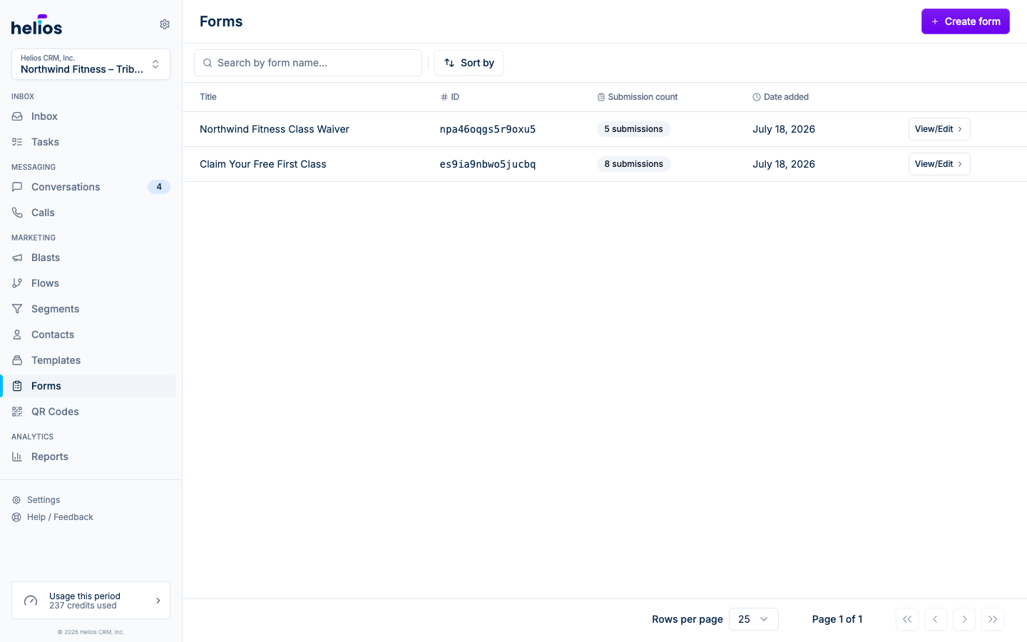
The form builder
The form detail page keeps everything in one place:
- Performance: unique visitors, submissions, conversion rate, sources, and individual responses.
- Build: questions, contact fields, steps, and content blocks.
- Design: color mode, brand color, imagery, and type. The Build canvas always renders your design, so Build and Design show the same live form.
- Share: hosted link, website embed, popup and takeover delivery, and link preview.
A new form walks the same path as numbered steps: 1 Build, 2 Design, 3 Share.
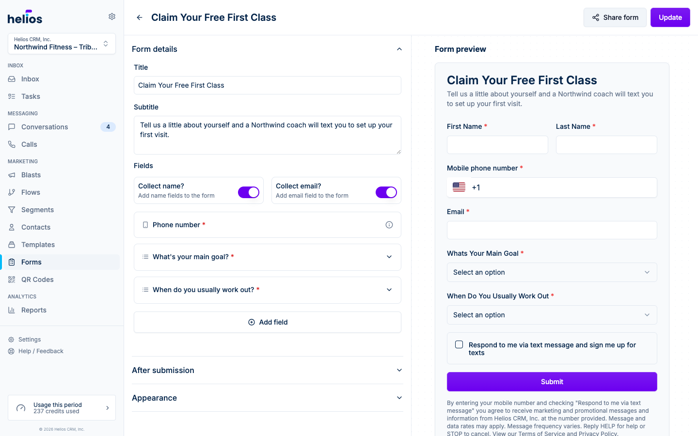
Build the form
Open Build to work on the form. Drag a field from the left panel onto the form, or click a field type to add it. Select anything on the canvas to edit its settings in the right panel. Drag a question to reorder it, or use the up and down controls in its toolbar.
The first time you build a form, a short welcome tour points out the canvas, the field palette, content blocks, and the steps to launch. Until it has questions, a new form also suggests a few common ones; tap a suggestion to add it with the label already filled in.
The dropdown at the top of the left panel, How visitors answer your questions, picks how questions appear. New forms start on One at a time: visitors answer one question per screen with a progress bar, and the canvas numbers each question with the screen it lands on. Prefer a single page of questions? Switch to All together. You can change this at any time.
On a smaller screen the builder gives the form itself the full width: use Add field on the canvas to add questions, and settings slide in from the right when you select something.
Select the header to set the title, subtitle, optional logo, and alignment. You can also click the title in the builder header at the top of the page to rename the form in place. If you save without a title, Helios names the form from the first heading, or Contact form when the form collects name or email. The subtitle is rich text: add line breaks, bold, italics, and links, and they render exactly as written on the live form. Mobile phone number is always included because Helios uses it to create or match the contact. Select a built-in contact field to turn name or email collection on or off.
Consent checkboxes
Every form ends with a text-message consent checkbox next to the submit button, and forms that collect email add an email consent checkbox below it. The text checkbox always starts unchecked, because US texting rules require visitors to opt in themselves. The email checkbox starts checked (US email rules allow it) and visitors can untick it. Both answers are saved with the submission, and the fine print under the button explains each program and links your legal pages.
Custom fields
| Type | Use |
|---|---|
| Text | Single-line answers. |
| Long text | Multiline answers. |
| Dropdown | Pick one option from a menu. |
| Multi-select | Pick any number of options. |
| Radio group | Pick one visible option. |
| Checkbox | Yes/no, with the option to require it. |
| Date | Date picker. |
| Number | Numeric input with optional minimum and maximum values. |
| Validated email input. | |
| Phone | Validated phone input. |
| Signature | Drawn or typed e-signature for waivers and agreements. |
| Hidden | Capture a default or URL value without showing a question. |
Each visible field has a Label, optional Placeholder, and Required control. Depending on the field type, you can also reorder options, add validation, prefill from a URL parameter, or add conditional logic.
For Dropdown, Radio group, and Multi-select, turn on Include Other option to add a free-text choice. When a visitor picks it, a short write-in opens so they can type an answer that is not on the list. The typed answer is what gets saved on the contact.
Answers are saved onto the contact as properties. The field’s saved name stays stable even when you improve the label later, so existing segments and personalization continue to work.
Signatures and waivers
Add a Signature field to collect an e-signature. Visitors choose how to sign:
- Draw (the default): sign with a finger, stylus, or mouse.
- Type: type their full name and it appears in a script signature style.
Clear starts over. The signature box follows the form’s light or dark design. Mark the field Required so the form cannot be submitted unsigned.
For a waiver, drag a Heading and a Text content block with the waiver right above the Signature field, turn on Scroll long text for the waiver text, then add a required Checkbox such as “I have read and agree to the liability waiver”. Each signature is stored securely with its submission, along with when it was signed and the signer’s IP address. The contact records the date they signed; the signature image stays on the submission. See Submissions to view signatures.
Conditional logic
Open Logic in a field’s settings to show or hide that field based on earlier answers. Add one or more conditions, then choose whether all or any of them must match.
Multi-step forms
On the All together flow, click Add step below the canvas to split a longer form into smaller pages. The new step becomes active immediately. Drag questions onto the step where they belong, click a step to rename it, and use the step tabs to move through the form. The bar always ends with a Confirmation tab showing what visitors see after they submit. The One at a time flow paces the form automatically, so steps do not apply there.
Content anywhere on the form
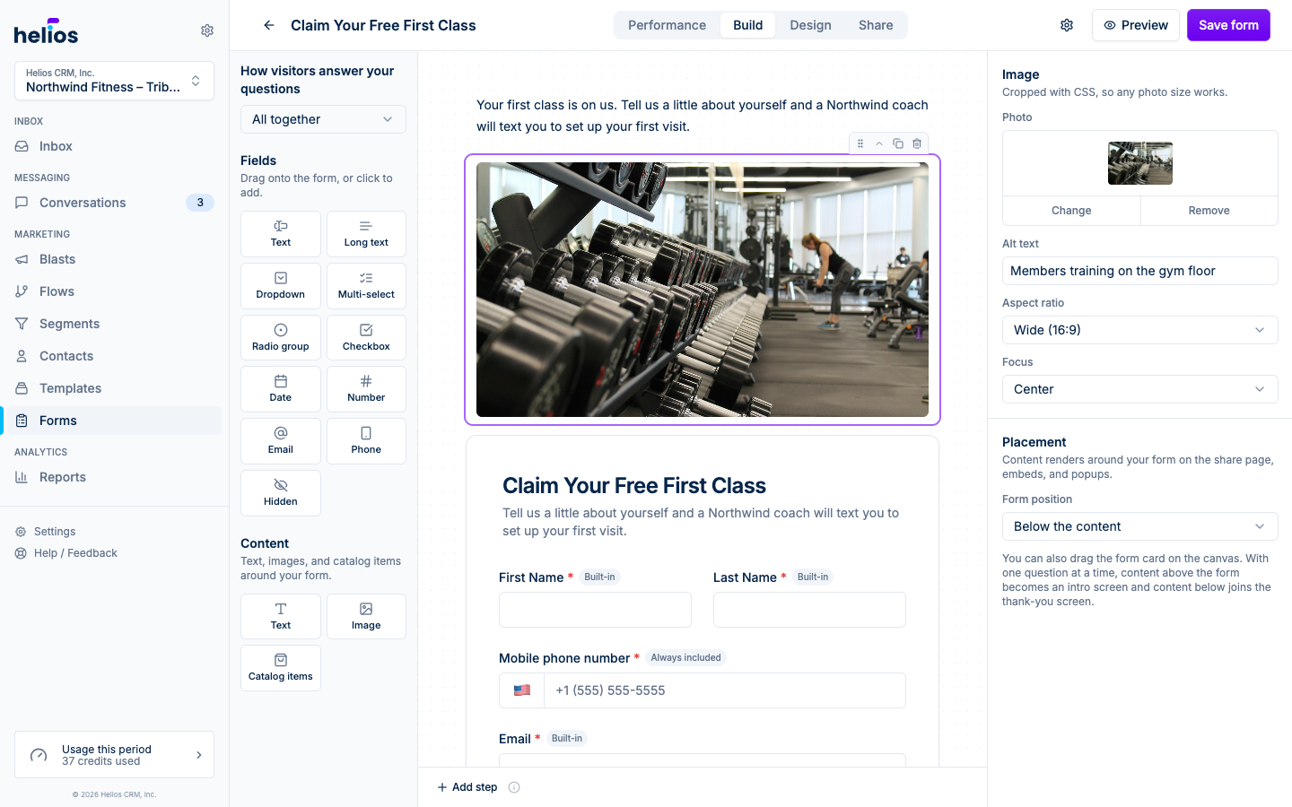
The Content group under the field palette adds headings, text, and photos anywhere on the form: above it, between your questions, or below it. Drag a block to where you want it on the canvas, or click a block type to add it above the form. Blocks use your form design, so they match the form in light and dark mode without extra setup.
| Block | Use |
|---|---|
| Heading | Large title text in two sizes. Lead the page with your offer. |
| Text | Paragraphs, lists, and links. Pitch the offer before the questions. |
| Image | A full-width photo. Pick an aspect ratio and focus point so any photo size looks right on phones and desktops. |
Select a block to edit its content in the settings panel on the right, the same way the form header works. Text blocks support bold, italics, links, and lists. Turn on Scroll long text to keep long text, such as terms or a waiver, in a fixed-height box that visitors scroll through.
Between questions, a block sits in the question list: drag it to reorder it with your questions, put it on a step, or show and hide it with conditional logic. It collects no answer, so it never appears in submissions or exports. On One at a time, a block between questions shares a screen with the question after it, so waiver text and its signature appear together.
Around the form, the canvas keeps two clearly labeled regions with the form between them, and the labels follow your question flow. On All together, content sits above and below the form card. On One at a time, the regions move inside the form and are labeled Intro screen and Confirmation screen, because that is what the content becomes: blocks above the questions open the form as a welcome screen with a Continue button, and blocks below join the confirmation screen. Drag a block to move it anywhere, including in and out of the questions, or change Position under Placement in its settings.
The Confirmation screen region also shows the screen’s title and confirmation message, exactly as visitors see them. Click them to edit the title and copy, or switch to a redirect, in the settings panel.
Content renders everywhere the form appears: the hosted link, website embeds, popups, and takeovers.
After submission
The confirmation screen is editable right on the canvas: on One at a time, click it in the Confirmation screen region below the questions; on All together, open the Confirmation tab next to the step tabs at the bottom of the canvas. Both open the same settings, where you can change the title (it defaults to “Thank you”), edit the message, or redirect the visitor to another page instead, such as your booking page.
Open the More menu (the ⋯ button) in the builder header and click Settings to configure everything else that happens after submission. Form settings are grouped into tabs:
- Submissions
- Add to lists: add every submitter to one or more static lists. Pair this with an Added to list flow trigger for immediate follow-up.
- Send submission as message: put the submitted answers in the contact’s conversation so your team can see and reply to them.
- Filter spam submissions: silently discard bot submissions caught by the form’s honeypot field.
- Mariana Tek: send submitters to Mariana Tek. This tab appears when the inbox has the Mariana Tek integration. See Send submissions to Mariana Tek below.
- Legal: optional privacy policy and terms URLs, linked from the consent fine print under the form.
Send submissions to Mariana Tek
When the inbox has the Mariana Tek integration connected, Form settings include a Mariana Tek tab. Under Contact sync, turn on Send submissions to Mariana Tek and every submission creates the person’s Mariana Tek profile at your location, or updates it if they already have one. Name, email, and phone come from the form’s contact fields, so the form needs to collect name and email. Use the dropdowns to also send Date of birth, Emergency contact name, and Emergency contact phone from your own questions. Blank answers never erase what is already on the profile, and an existing profile’s email is never changed.
- Waiver: Mark waiver as signed sets the waiver on the Mariana Tek profile after each submission. Pair it with a Signature field; the tab warns you if the form has none.
- Free items: click Add free pack or product to pick a $0 item from your synced Mariana Tek catalog, such as your location’s First Class Free credit pack. Helios places a $0 order for it at the location, so the pack’s own class count, expiration, and rules from Mariana Tek apply. For each item, choose First-timers only (people who have never taken a class) or Everyone. A person only receives each item once per form, even if they submit again.
A form with Send submissions to Mariana Tek on and nothing else selected still creates or updates the contact in Mariana Tek, which works well for presale giveaways and waitlists. If Mariana Tek rejects a step, the submission still goes through and Helios creates a task so your team can finish it by hand.
Design the form
Switch to Design to style the form. The live preview shows the same canvas you built, questions and content blocks included, so you are styling exactly what visitors will see. Pick a brand color and Helios builds matching light and dark palettes with readable contrast, so one choice looks right everywhere. If the inbox has a ready Brand kit, a new form opens with Match visitor color mode (unless the kit is locked to dark), plus the kit’s brand color, font, and corner radius already filled in.
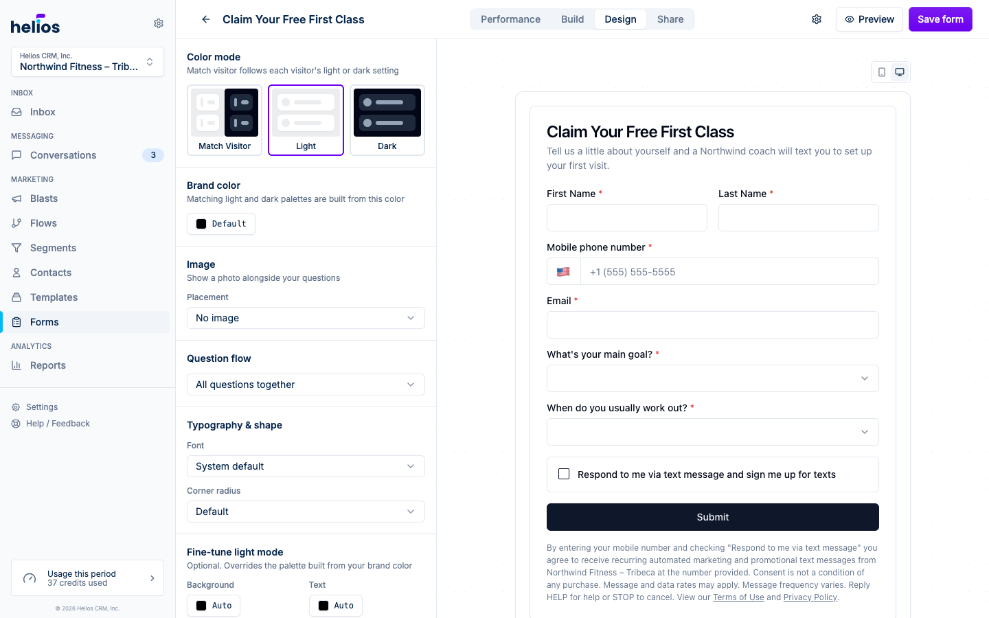
- Color mode: Match visitor follows each visitor’s light or dark setting, or lock the form to Light or Dark.
- Brand color: buttons and accents in both palettes come from this color. Body text stays neutral. The form’s background stays white in light mode and near-black in dark mode unless you override it below.
- Fine-tune colors: override the background, text, or button colors. Each swatch shows the color the palette already produces, so you can see what you are changing before you change it. On Match visitor, tabs switch between the light and dark palettes; on a locked mode you fine-tune just that palette. Helios nudges overrides that would make text unreadable and marks them as adjusted.
- Frame: Card shows the form on a bordered card, the default. No border drops the card so the questions sit directly on the page; your background color then fills the page behind the form instead of the card. Both work with either question flow.
- Image: show a photo above the questions or beside them. Choose Top of the form, Left of the questions, or Right of the questions; side images move above the questions on phones.
- Typography & shape: font family and corner radius.
The preview updates in place as you make changes. Use the toolbar above it to check the form on phone and desktop widths, and, when the color mode is Match visitor, in both light and dark mode. With No border selected, the preview area fills with your background color so you see the page visitors get.
Forms with more than one screen (one question at a time, or several steps) add a screen stepper to that toolbar. Use its arrows to page through every screen, including the confirmation screen, without filling in required answers.
For a closer look, click Preview in the header. It opens the form full screen at the width visitors actually get, with the same phone, desktop, color mode, and screen stepper controls.
Share and measure
Open Share to copy the hosted link, customize how it previews in texts and social posts, embed the form on a website, or open it over your site as a popup or full-page takeover. See Sharing and embedding forms for the installation steps.
After the form is live, Performance shows unique visitors, submissions, conversion rate, traffic sources, and the response table. Views count each visitor once, so refreshes and repeat visits do not inflate the number. See Submissions for details.
Click Save after making changes. The hosted link updates immediately.